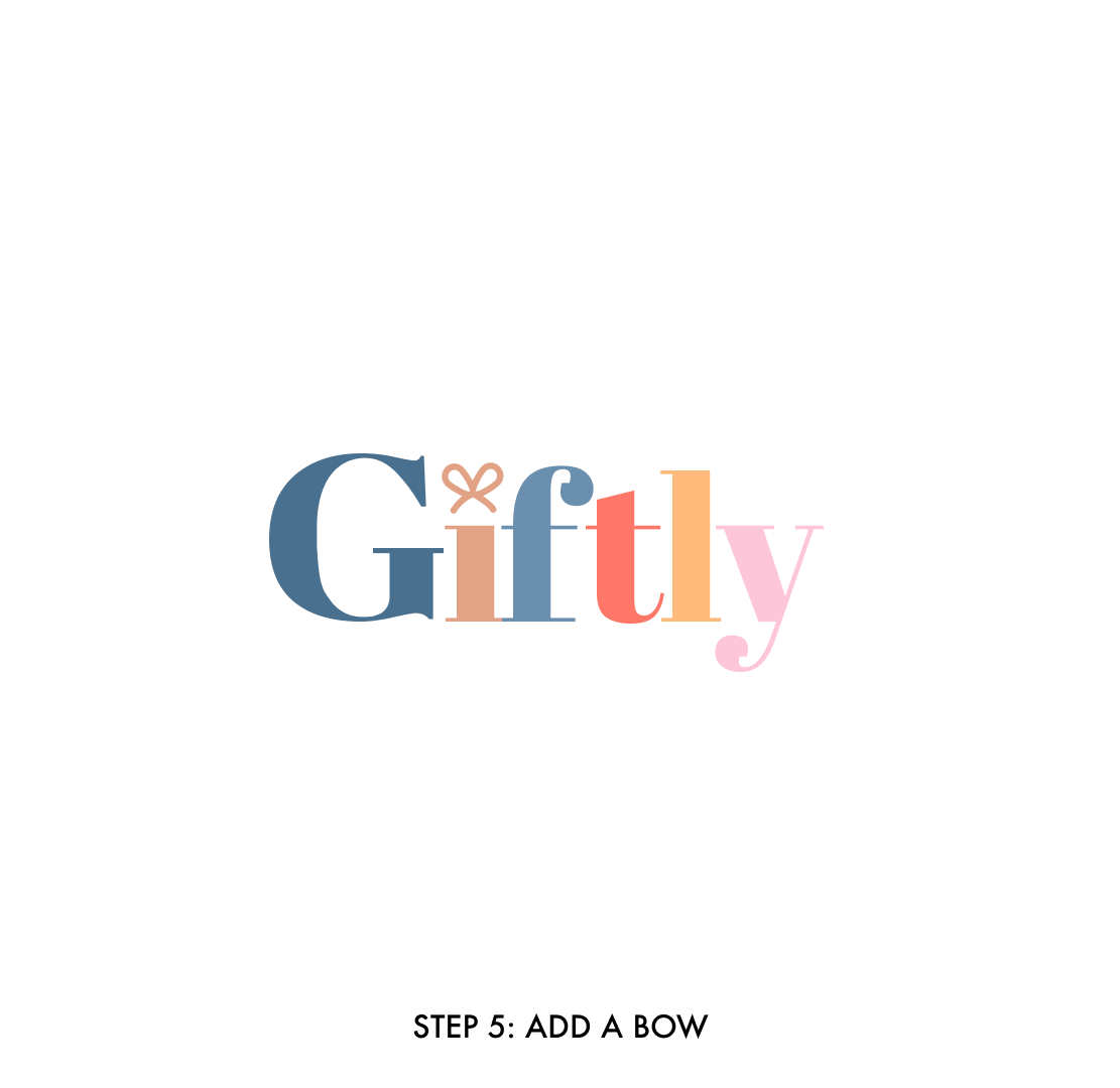
Giftly
Independent Case Study
Giftly is a mobile iOS app that helps users track and organize their gift ideas in order to reduce the stress associated with gift giving.
Role: Sole UI/UX Designer
Timeline: 10 weeks
Tools: Figma, FigJam, Google Docs

I’m happy to announce that Giftly was selected as one of the Best Bright App Designs by DesignRush!

Step 1: Empathize
Introduction
The holiday season is approaching.
Pretty lights, friends and family getting together, eating good food and of course, opening presents.
You’re going to have to get a gift for everyone. Your parents, your brother or sister, their new partner they’ve decided to bring to the family gathering even though they’ve only been dating for 3 months. Your aunt and uncle, their kids, some friends you’ll be seeing at a holiday party, your boss, maybe a co-worker. Or two.
What do you get them? Will they like it? Do they already have it? What are other people getting them?
Stressed yet?
The Problem
2000 consumers were polled about their gift giving stress. Of those who said they were stressed, 64% were women; many of whom said it was because they needed to find the “right gift”. Additionally, the 2021-2022 Gift Giving Report cites that the gifts people enjoy receiving the most were gifts that were “related to your favourite things or things that you love.”, highlighting the importance of finding the ‘perfect gift’.
Based on this, I hypothesized: Women are the most stressed about finding the perfect gift that comes from the heart.
From here, I asked
How might I help North American women find the perfect gift in order to reduce the stressful time spent searching for a gift?
Talking to People
My hypothesis was the entry point to conducting interviews. I wanted to talk to the people who this problem affected so I could more effectively design something that will help them.
From the interviews, I identified three themes that were consistent amongst the users.
Budgeting and Finances
Users were stressed about not having the finances to pay for the gifts they wanted to get everyone. I definitely empathized with the users on this, but wanted to make sure my product didn’t turn into a budgeting app.
Finding the Perfect Gift
I did find that this theme most aligned with my hypothesis, however I became increasingly worried about the viability of an app that could tell people what unique gift to get their significant other for Valentine’s Day. I didn’t want to be liable for that.
Tracking and Organizing Gift Ideas
To my surprise, the users had so many ideas that they couldn’t keep track of them all and would become frustrated with themselves when the time came to give a gift and they couldn’t remember any of them. I decided to go with this theme because I felt it was where I could most effectively help my user.
Chosen Theme
Tracking and Organizing Gift Ideas
“I don’t like any of the ways I keep track of them now because I don’t have a formal way of doing it.”
“If I don’t write something down immediately after I think of it, I will forget.”
“I save a link and a photo so I can reference the link whenever. It also lets me know if something is still available.”
After conducting primary research, I revised my How Might We Statement to the following:
How might I help young, North American women better track and organize their gifting in order to reduce the stressful time spent searching for a gift?
Step 2: Define
Persona
While all of this research was very valuable to my process, it is very difficult to empathize with data. With empathy being a main pillar of my design process, I created a persona based on the data I collected to represent my user. This persona allowed me to empathize with the users I was creating this product for; and was my guiding light throughout the entirety of the design phase.
Experience Map
In my interviews, I asked users to walk me through their gift giving process. I synthesized their experiences into one journey as I envisioned Sam’s gift giving process. This allowed me to identify points in their gift giving where users experience the most friction. These points of stress were identified as design opportunities to intervene and alleviate the users’ stress and frustration.
Step 3: Ideate
Task Selection
After creating the persona, I wrote 40+ user stories not only to brainstorm the capabilities of my app, but also to ensure I was addressing the needs of the user.
When it came time to picking my core epic, and related user story I considered what the MVP (minimum viable product) of my app would be, making sure it stayed consistent with my How Might We Statement. Which led me to pick Saving a Gift Idea as my core epic from which I built my task flow.
Core Epic
Saving a Gift Idea
UI Inspiration
First, I gathered UI Inspiration both to determine what is working for users, but also to ensure that my designs remained consistent within the wider UX landscape.
Based on my task flow, there were 3 main locations.
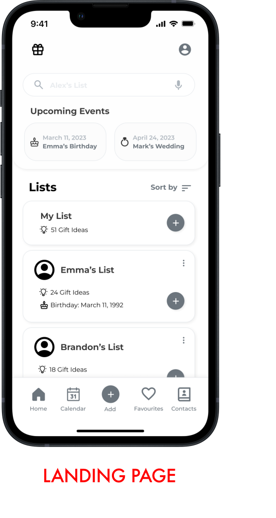
The Landing Page
Two of the main challenges users identified were:
Users wanted to be more organized in tracking their gift ideas
Users wanted to have photos, links and notes all in the same place
As a result, I wanted the landing page to communicate clear information architecture.
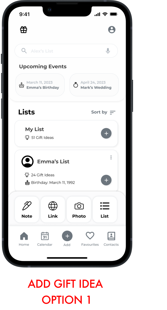
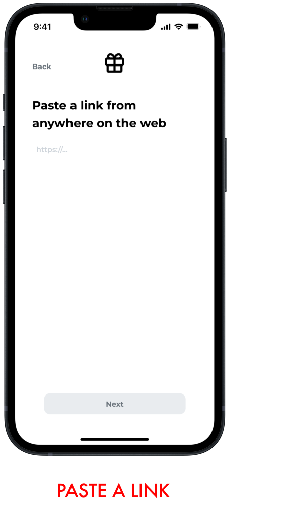
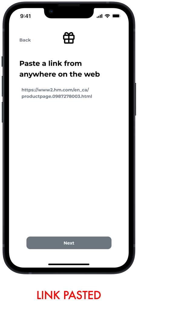
Adding/Pasting a Link
As previously mentioned, users wanted to save photos, notes and links all in the same place as users will often have different methods of documenting their ideas. As a result, I wanted to give the user options between Link, Note and Photo once pressing the “Add” button.
For this task flow, the user picks ‘Link’. I chose this option for two reasons:
Based on my research, there has been a significant increase in online gift shopping
Considering my MVP, and users’ preference for efficiency, adding a link is the most efficient way the user could get from point A (thinking of a gift idea) to point B (saving it in Giftly)
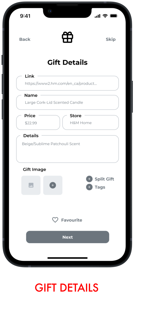
Gift Information Fields
Lastly, from my interviews I gathered that users had a tendency to save more information about their gift ideas rather than less - contributing to the disorganization.
As a result, I wanted to add a section where users could add a variety of details about their gift such as store, price or notes about size, colour, generation etc.
Sketching
With this information in mind, I moved on to sketching. One of my enemies as a designer is over-thinking. With gift giving being a problem that affects a wide range of people (myself included) I needed to ensure that I was designing for my persona instead of designing for a broader user base or designing for myself.
As a result, I utilized the crazy 8’s method, where I sketched 8 versions of a location in 8 minutes. This allowed me to not only get a lot of bad ideas out, but it also forced me to think of quick, creative solutions grounded in my UI Inspiration rather than thinking of what I would want to see as a user of this product.
“I needed to ensure that I was designing for my persona, instead of designing for myself.”

After Creating all of these sketches, I then took my time to consider which sketches featured elements that aligned with my users’ needs and combined the various elements into one solution sketch from which I built my wireframes.
Step 4: Prototype
Mid-Fidelity Wireframes
I translated my sketches into grayscale wireframes in Figma and created a working prototype. This design went through two rounds of testing, with changes being implemented after each round, resulting in 3 versions of the greyscale prototypes.
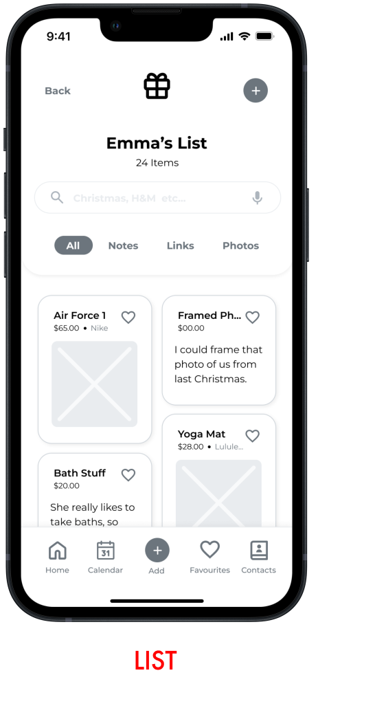
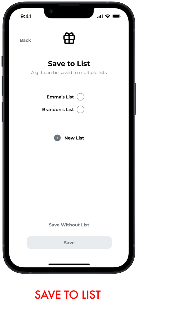
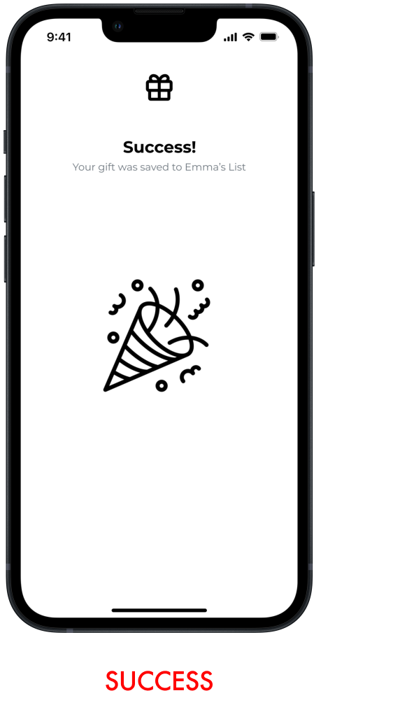
The task the users were asked to complete was:
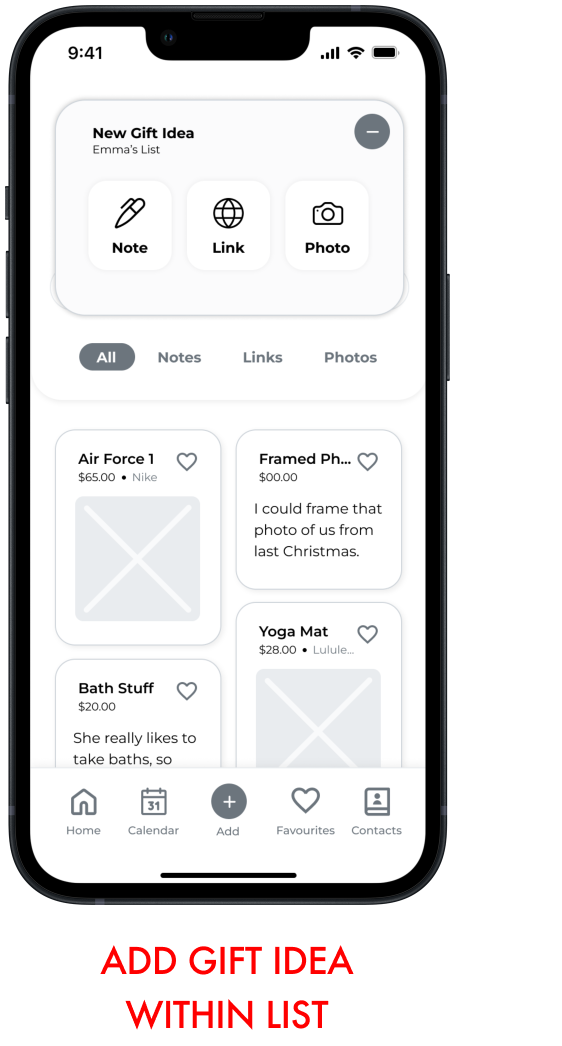
Adding a gift idea they found online to Emma’s list.

Step 5: Test
User Testing
One of the most important steps in the entire UX design process - if not the most important step - is to conduct user testing. After all, how are we meant to design something of value for users if we don’t involve them in the process?
I conducted user testing in two different rounds, each with 5 people, making changes between both rounds of testing. All the users were asked to complete the same task: Adding a gift idea they found online to Emma’s list. I asked questions that weren’t leading or gave the users a hint on where to tap. I simply gave them the task, and allowed them to explore. This was beneficial to me as I was able to see the users navigate the app naturally and without external influence.
The outcomes of the user testing for Giftly were enormously valuable. Not only did it highlight biases in my work, but it also reinforced the need for this product. Below are the major changes made between versions 1 and 3 of the greyscale wireframes.
“How are we meant to design something of value for users if we don’t involve them in the process?”
Landing Page
Importance to the User
The first major change that was made between the different greyscale wireframes was the information featured on the Landing Page. In the first version, while the users knew what all the information was many users mentioned wanting to know important dates. This led me to adding the Upcoming Events section. Additionally, I added a users’ birthday to their list card. I also removed the photos, because I realized the landing page would be too busy once all the photos were added.
Add Gift Idea
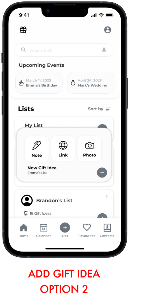
Shortcuts
In the first version of the prototype, the only option that was prototyped for the user to add a gift idea was the ‘plus’ button in the navigation bar. In the first round of user testing, every single user thought the bottom plus button was to add a new list. Additionally, each user wanted to add a gift idea to Emma’s List by pressing the plus button on Emma’s List. This made a lot of sense, as the user will always find the shortcut for completing their task.
Gift Details
Personalization
One important thing I learned in my user testing is that each use has a slightly different way they want to label or organize items. For this reason, I added extra elements to the gift details page. Allowing the user to choose their own organizational scheme within the parameters set by the design.
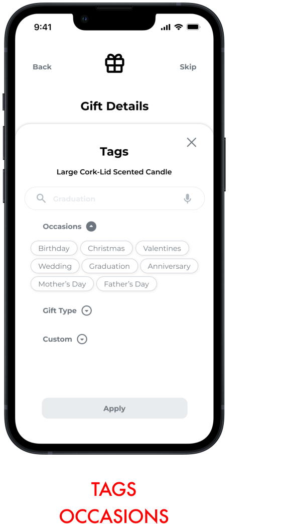
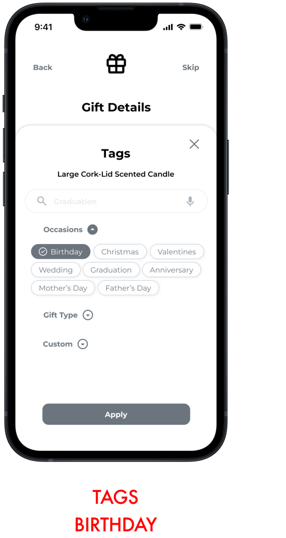
Adding a Tag
Personalization, Part 2
To further the customization of a users’ gift idea, in addition to assisting in the searchability of gift items, I added an additional optional step in the task flow of adding a tag.
Step 6: Refine
Brand Development
With the wireframes finalized, I started thinking about the visual identity of Giftly before creating the high fidelity prototype. The first step was to think about a “more A than B” list. The purpose being to gain a general understanding of the feeling of the app before diving into colour. Many of the More A than B statements were inspired by the findings from the user interviews during the Primary Research phase.
More friendly than serious
More playful than stoic
More sunshine than moonlight
More soft than hard
More freeform than formulaic
More inclusive than exclusive
More welcoming than reserved
More clear skies than rainy days
The More A than B statements helped me to narrow down a list of adjectives that best described the feeling of my app. These adjectives were referenced when it came to selecting the name of the app, the colours and the typography, ensuring the entire brand was cohesive.
A list of adjectives that describe the feeling of the app
Friendly, Playful, Welcoming, Sunshine
Naming the App
From there, I used these adjectives as a guiding light to start thinking about names for my app. I wanted the name to communicate three things.
I wanted it to communicate the tone of the app
I wanted it to communicate the purpose of the app
I wanted it to be catchy and memorable
I came up with 3 options, but ended up choosing:
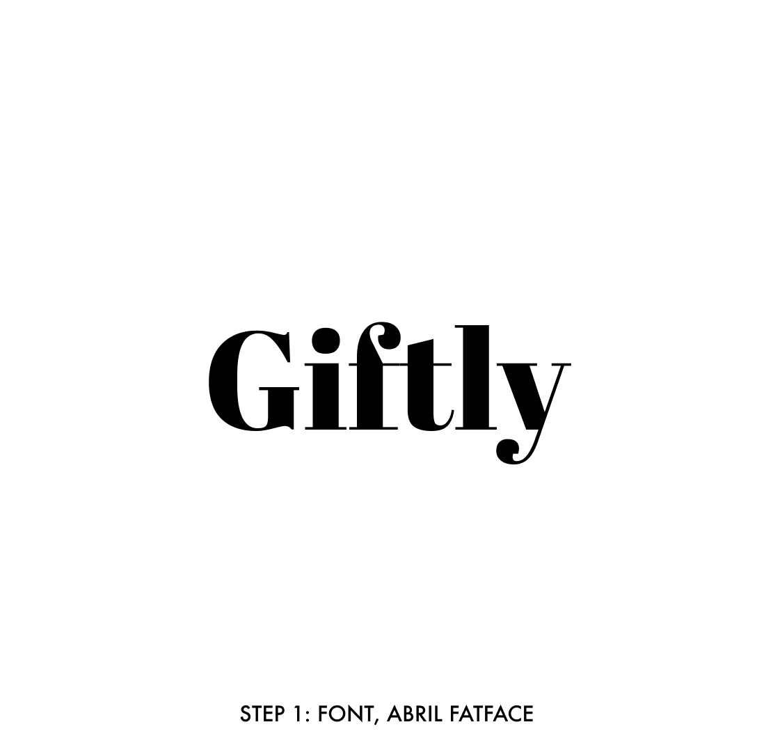
Giftly
Moodboard
With an app name and list of adjectives I moved forward to finding visual inspiration. I focused on images, colours and patterns that evoked the “feeling” of my app. Whether it be through colour, composition, or medium. The following are some of the images I collected.
In my user interviews and my persona, users consistently mentioned feeling excited about giving a gift to someone. For that reason I chose to focus on brighter, happier colours to help mirror the users’ feeling of excitement.
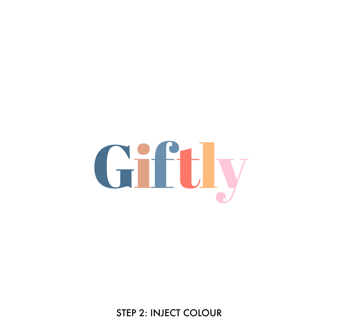
Wordmark
After developing the moodboard, I furthered my branding by creating a wordmark and app icon.

Colours & Typography
In keeping with the Giftly brand, I wanted the colours of the app to match the colours on the wordmark. Additionally, I wanted the typography within the app to be Sans Serif for readability but still have a soft, friendly feeling.
Putting it all together
After determining the colour palette, typography and branding it was time to create the final high fidelity product.

Key Features
Displayed below are some of the key features within the Giftly app.
Add a Gift Idea from Anywhere
Auto-populate Gift Details
Customize with Tags
Next Steps
Responsive Marketing Site
In order to bring Giftly to market, I designed a responsive marketing site for web and mobile. The purpose of the site is to inform and intrigue users about Giftly.
I used the same colour palette and moodboard to inform the design of the site. I wanted users to get a taste of what it would be like to use Giftly through visiting the site. I included key features, reviews and a learn more section.
Another addition I made was The Giftly Blog. Looking forward, Giftly is a brand that can not only find new users through SEO blog posts, but the blog also instills and builds trust within the active user base.
What’s Next?
Giftly is only in it’s beginning stages. There are lots of factors when it comes to gift giving stress, and Giftly has only scratched the surface. However, looking back on my user interviews and the themes that came out of it, there are two features I am considering in expanding the Giftly App.
Adding a Budgeting Feature
Some of the possibilities with this are allowing users to set a price per holiday per person, filtering for gifts within their lists in a certain price range, and tracking overall spending for gifts.
Partnering with Stores/Brands
There is an opportunity for Giftly to partner with many retail and gifting brands, where users can not only buy gifts through the app with a third party retailer, but they can also browse wrapping paper, bows, bags etc. So they can buy everything they need to make their gift perfect all in the same place!
It is important to note that neither of these suggestions have been tested, and any expansion Giftly may take would involve user interviews and testing.
Additional Considerations
As part of a future thinking exercise, I pulled two cards from the Tarot Cards of Tech.
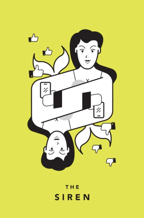
What would using Giftly too much look like?
As there is a section where a user can make notes about a person they’re gifting to, there are possibilities where an avid user would put confidential information about a person in the notes section.
This information would need to be approved to send before sharing a profile with another.
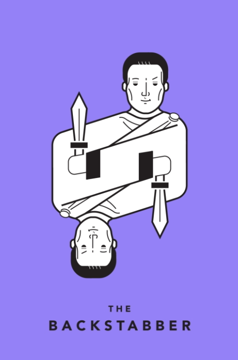
What would cause users to lose trust in Giftly?
Since Giftly is a tracking app, where users can save gift ideas they would otherwise forget. As such, if there were any technical issues which caused a user to lose all of their ideas, they would immediately lose trust in the app.
As a result, the Giftly software would need to stay up to date to prevents bugs and malware. Additionally, users would feel trusted if they knew there was a way to back up their gifting information.
Key Learnings
Looking at the work I accomplished in 10 weeks, there were plenty of opportunities for learning. The key learning I came away from this project was to always trust the users. By this I mean, trust that they know what they want and what would work for them.
Coming from the world of filmmaking, and more specifically as a cinematographer, I was always hired for the decisions and choices I made as an artist. As I transition into UX design, I know that I can trust my own creative instincts, but when it comes to the decisions that I make, they will always be informed by the user.
Furthermore, I have learned that there is no room for ego in design. If something isn’t working it’s not because I did a bad job, but instead because it isn’t working for the user. Becoming attached to a design is the worst thing that can happen. Instead, become attached to your user.
