QMed
Independent Case Study
QMed is a mobile iOS app that helps LGBTQ+ patients find doctors who are knowledgeable in LGBTQ+ healthcare so they can feel safe when seeking medical attention. This project stops at mid-fidelity.
Role: Sole UI/UX Designer
Timeline: 3 weeks (stop at mid-fidelity)
Tools: Figma, FigJam, Google Docs, Zoom

Step 1: Empathize
Introduction
Canada is home to approximately 1 million people who are part of the LGBTQ+ communities, accounting for 4% of the total population aged 15 and older. However, despite the growing LGBTQ+ population, the healthcare system is not growing and learning with them.
While most of the time it is unintentional, bias toward LGBTQ+ people can result in poor quality of care related to discrimination based on sexual orientation and/or gender identity. Simultaneously, LGBTQ+ people are more likely to have compromised immune systems, rate their health as poorer and seek urgent care less.
The Problem
5 hours
The average amount of time spent studying LGBTQ+ health in the Canadian and US medical school cirriculum.
2
The number of LGBTQ+ focused clinics in Toronto, the largest city in Canada.
Stigma
Some LGBTQ+ persons have reported being refused treatment, verbal abuse and disrespectful behaviour when seeking medical care.
1 in 7 LGBTQ+ people have experienced some form of unequal treatment from healthcare staff because they’re LGBTQ+. As a result, many LGBTQ+ patients seek health care services less despite their increased risk for eating disorders, cancer, HIV, mental health disorders and more.
Based on this problem statement, I hypothesized that LGBTQ+ people seek medical far less their their cisgender, heterosexual counterparts.
From here, I asked
How might we help LGBTQ+ people feel safe in order to reduce their stress when seeking medical care?
Talking to Users
My hypothesis was the entry point to conducting interviews. I wanted to talk to the people whom this problem affected so I could more effectively design something that will help them.
I interviewed 5 members of the LGBTQ+ community. In the interviews, I identified a person’s pronouns and whether they were a person of colour. I did this because a person’s race, pronouns, gender etc. also affect the care they recieve. I wanted to be aware of the additional stigmas my participants face when considering their answers.
From the interviews I identified three themes that were consistent amongst the users:
Gender and Pronouns
LGBTQ+ patients will avoid doctors offices and ERs out of fear of being misgendered. I definitely empathized with the users in this, however a digital solution to this problem would have to be accompanied by large systemic change.
Community Support
LGBTQ+ people trust their community more than their doctors because they believe their community understands and validates their medical concerns more than their doctors do.
Safety/Proper Care
LGBTQ+ patients perform far more extensive vetting and research in finding a doctor in order to feel safe enough to be open and honest with their practitioner without being judged. It is important to note that safety and proper care were combined because if a person doesn’t feel safe enough to be honest with their doctor, there is no way they can get the care they need.
I chose safety/proper care because amongst all the users, it was the theme that came up consistently, making me feel like it’s the most important to focus on.
Chosen Theme
Safety/Proper Care
“You need to trust that [your doctor] has your best interest at heart, and for that you need to feel safe.”
-Interviewee #5
After conducting primary research, I revised my How Might We Statement to the following:
How might we help LGBTQ+ patients know their doctor is knowledgeable in LGBTQ+ health so that they can feel safe when seeking medical care?
Step 2: Define
Persona
While all of this research was very valuable to my process, it is very difficult to empathize with data. With empathy being a main pillar of my design process, I created a persona based on the data I collected to represent my user. This persona allowed me to empathize with the users I was creating this product for; and was my guiding light throughout the entirety of the design phase.
Step 3: Ideate
Task Selection
After creating the persona, I wrote 30 user stories not only to brainstorm the capabilities of my app, but also to ensure I was addressing the needs of the user.
After writing the user stories, I picked Checking Doctor Reviews as my core epic. I chose this because of the safety that LGBTQ+ people feel when consulting other members of the community, therefore ensuring their doctor is a safe person to go to.
After reviewing this case study, I think the chosen epic more closely aligns within the theme of Community Support as opposed to Safety/Proper Care, and if I had to do it all again I would more closely evaluate the MVP (minimum viable product) of my app in choosing a core epic to support it accordingly.
Core Epic
Checking Doctor Reviews
UI Inspiration
First, I gathered UI Inspiration both to determine what is working for users, but also to ensure that my designs remained consistent within the wider UX landscape.
Based on my task flow, there were 3 main locations.
Sketching
With this information in mind, I moved on to sketching. One of my enemies as a designer is over-thinking.
As a result, I utilized the crazy 8’s method, where I sketched 8 versions of a location in 8 minutes. This allowed me to not only get a lot of bad ideas out, but it also forced me to think of quick, creative solutions grounded in my UI Inspiration rather than thinking of what I would want to see as a user of this product.
“One of my enemies as a designer is over-thinking”
Step 4: Prototype
Mid-Fidelity Wireframes
I translated my sketches into grayscale wireframes in Figma and created a working prototype.
Step 5: Test
One of the most important steps in the entire UX design process - if not the most important step - is to conduct user testing. After all, how are we meant to design something of value for users if we don’t involve them in the process?
I conducted one round of testing with 5 users. It is important to note that before each test was conducted, users were asked contextual questions about themselves, their familiarity with certain technologies/platforms and their familiarity/relationship to the LGBTQ+ community.
Major Changes
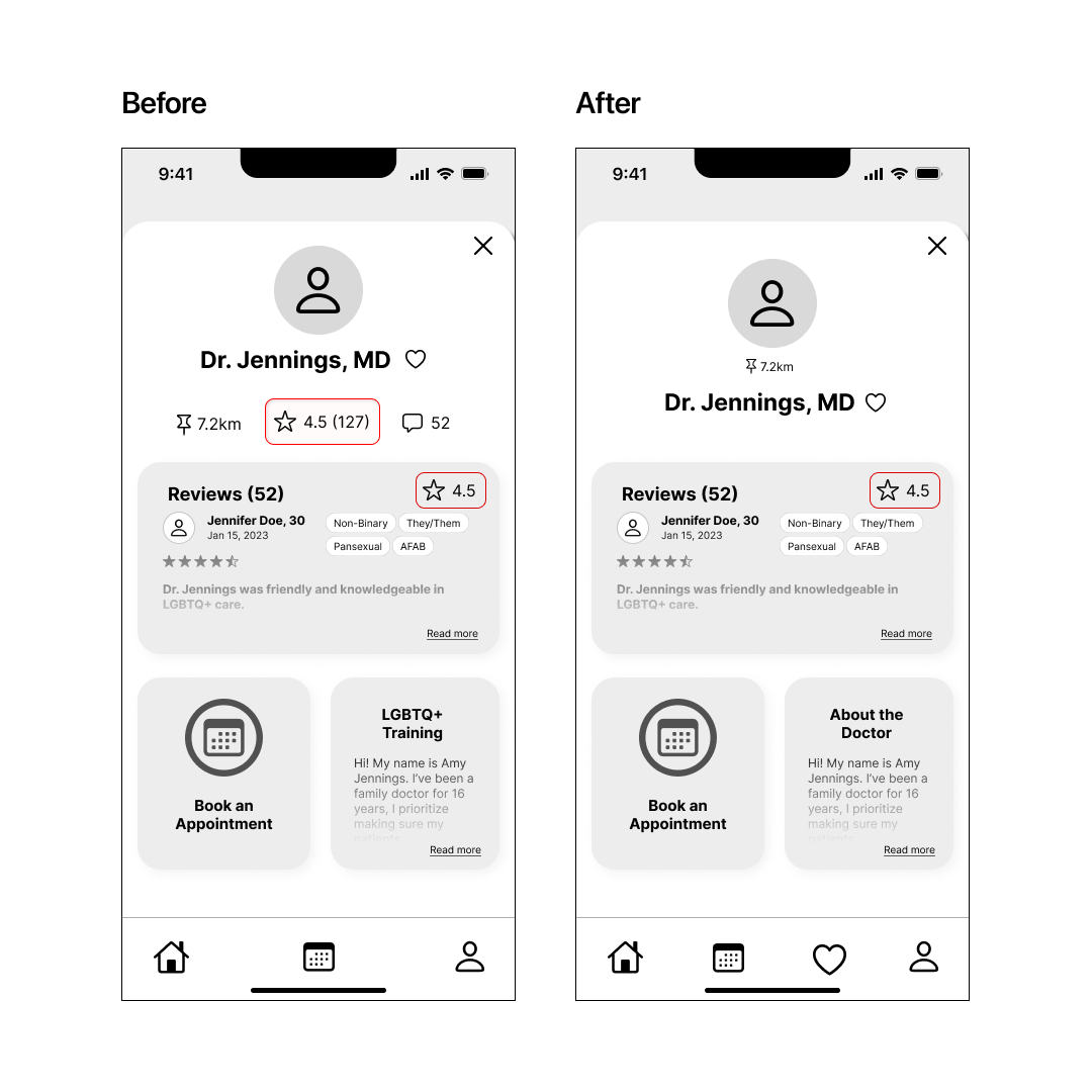
Many users confused the ratings icon underneath the Dr. Jennings profile image as an additional way to view reviews.

The two main issues within filters were 1. users expected the slider to go backwards from 2+ years, and 2. Users felt uneasy pressing the ‘x’ after adding filters, worrying their changes wouldn’t be saved.
